Desktop and Mobile Web Redesign
(3 Screens each)
Rotten Tomatoes is a popular platform for movie and TV show reviews, providing a comprehensive source of information for users. Currently the desktop website is outdated in terms of design, lacking optimal user-friendliness in its overall flow, and the layout of the grid and overall navigation may not meet modern user expectations.
Goal:
The primary goal of this case study is to identify redundancies in the existing UI and propose optimizations to modernize and enhance the user experience on both the website and mobile webpages.
Challenges:
Keeping a consistent layout from desktop and mobile. Creating changes that weren’t drastic as to potentially confuse current users.
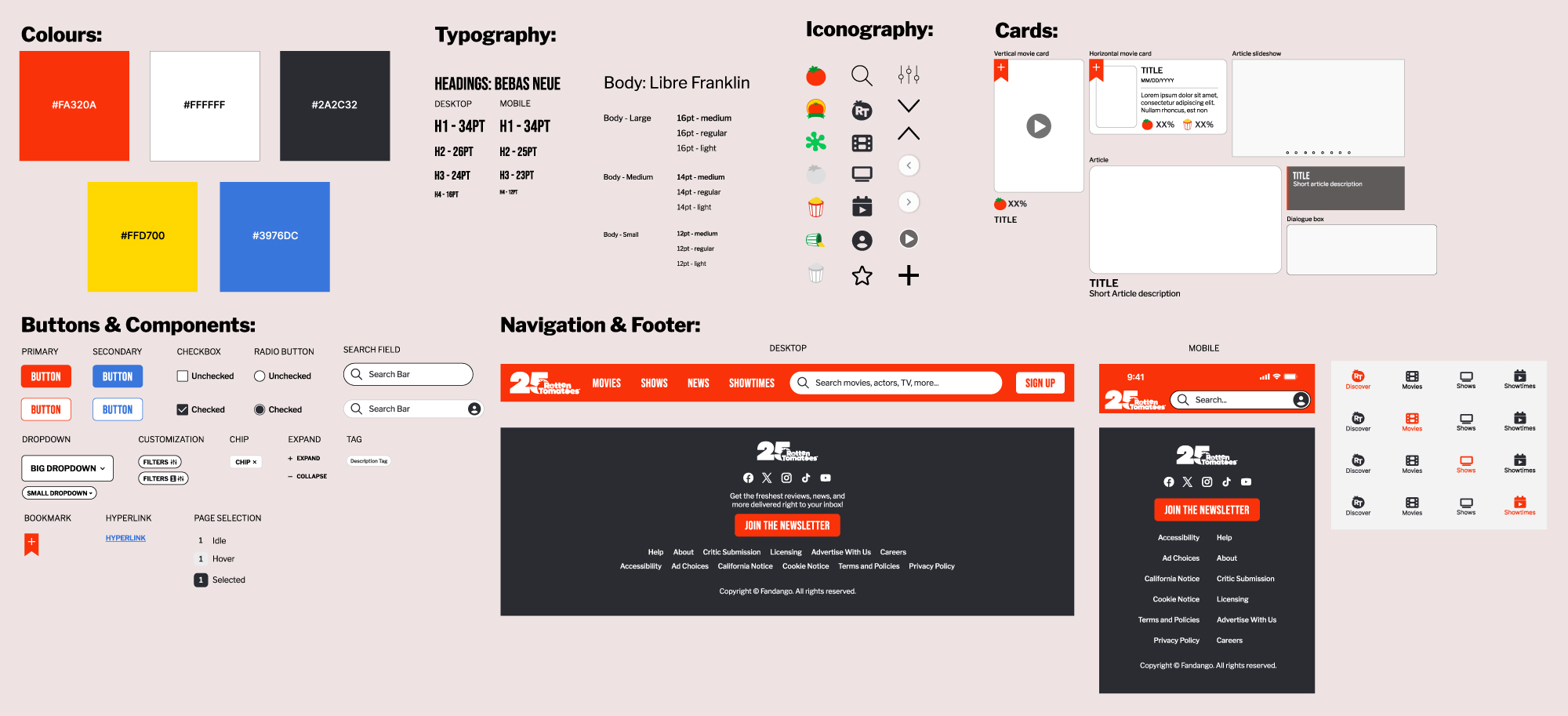
Programs used:
Adobe Photoshop, Adobe Illustrator, Figma
Wireframes
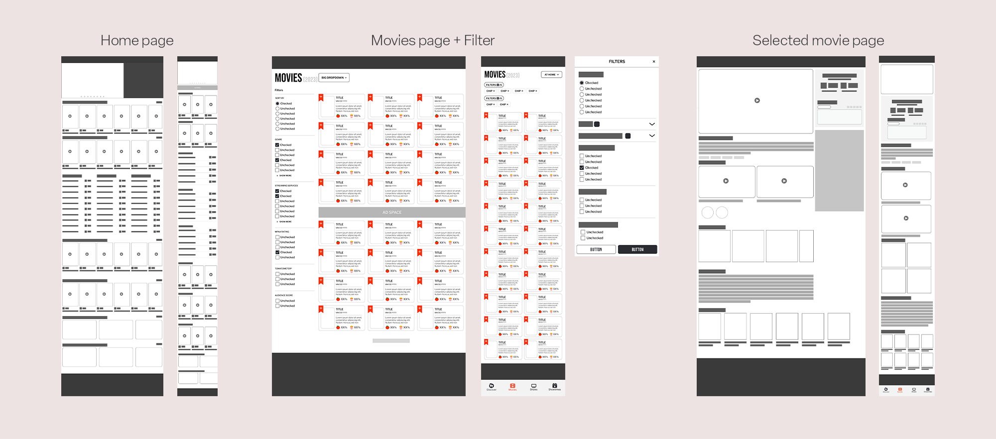
Desktop Homepage
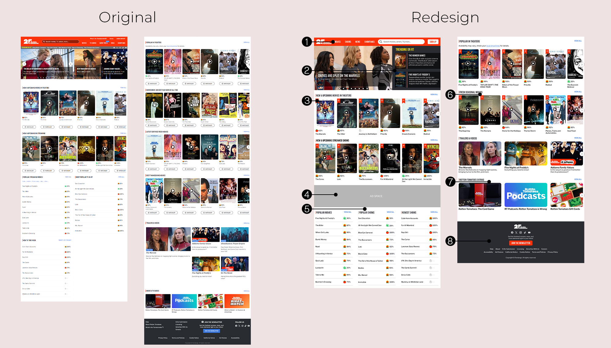
1. Minimized visual noise in the navigation bar and moving less relevant information moved to the footer for improved visual hierarchy
2. Expanded the "Trending on RT" section with the incorporation of two feature highlights. Additional news articles will be integrated with the existing gallery for a more cohesive presentation
3. Optimized the "Add to Watchlist" button, transitioning from a pill shaped button to a sleek bookmark icon, relocated to the corner of the movie poster for a more space-efficient design
4. Repositioned the advertisement area between content sections.
5. Leveraging the expanded width of the website to accommodate all three list sections in a single row. This adjustment enhances the overall user viewing experience
6. Many categories have been consolidated under the overarching theme of "Seasonal Movies". Users can still access a more extensive selection of relevant results by clicking the "View All"
7. Renamed 'Movie & TV Guides' to Rotten Tomatoes extras' aligning the category name with its focus on exclusive Rotten Tomatoes offering beyond standard movie and TV show reviews
8. Revamped the information hierarchy in the footer, increasing the visibility of key buttons such as social media by reorganizing and placing them at the top
Mobile Homepage
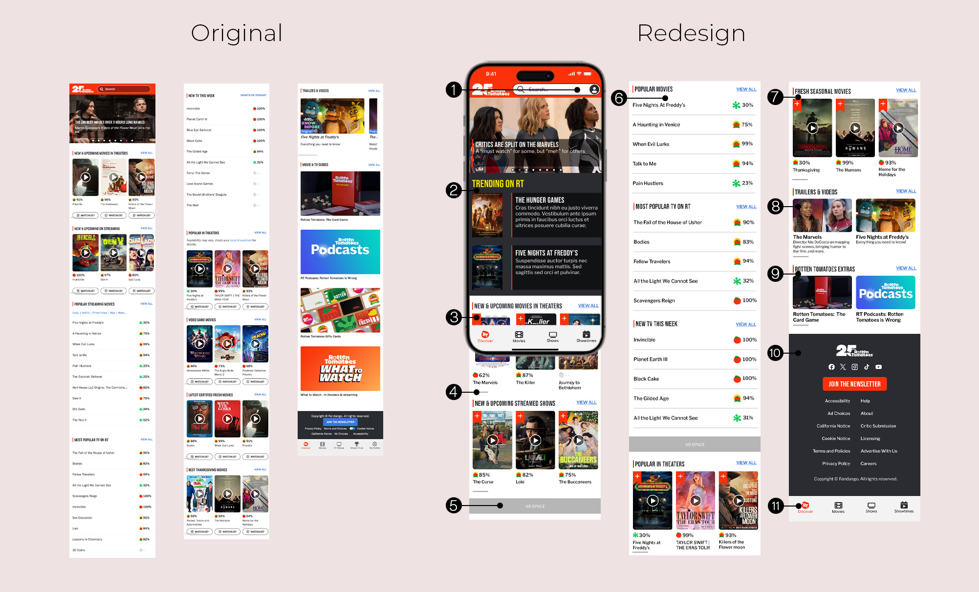
1. To keep consistent with contemporary design trends, the profile icon has been relocated to the top of the navigation bar
2. Maintained consistency with the desktop version by incorporating the two feature highlights
3. Ensured coherence with the desktop version by integrating the sleek bookmark icon
4. Movie selection side-scrollbar has been repositioned lower to minimize visual clutter
5. Relocated advertisement to between content sections, creating a seamless transition between different content areas
6. In an effort to mitigate user overstimulation, the quantity of movie titles per list has been reduced to five
7. Consolidated many of the overarching subcategories to "Fresh Seasonal Movies". Much like the desktop, users can click "View All" to access more results
8. Ensured visual consistency by standardizing the size of article cards, creating a more cohesive layout
9. Renamed 'Movie & TV Guides' to Rotten Tomatoes extras' aligning the category name with its focus on exclusive Rotten Tomatoes offering beyond standard movie and TV show reviews
10. Revamped the information hierarchy in the footer, increasing the visibility of key buttons such as social media by reorganizing and placing them at the top
11. Removed the "Movie Trivia" button from the bottom nav as it directed users to an external page. Profile button relocated to enhance accessibility
Desktop Movies Page
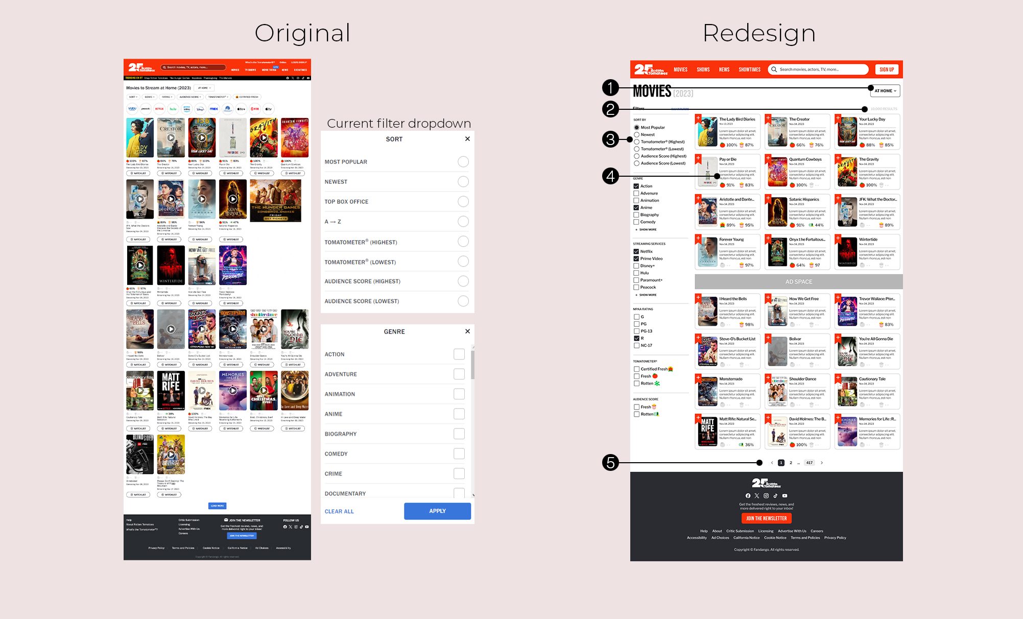
1. Page heading condensed and simplified, category dropdown brought over to the right side to balance the layout
2. Added a dynamically updating results counter for a more interactive and informative filtering experience
3 Revamped the filter system to feature a sidebar layout, presenting all filters and options visibly. Filters with numerous options now have the ability to display all choices
4. Movie cards enhanced by integrating the movie synopsis. Improved visual hierarchy by bolding the movie name
5. Implemented a page display for search results, replacing the vertical expansion. Users have the option to navigate through results incrementally or input an exact number
Mobile Movies Page
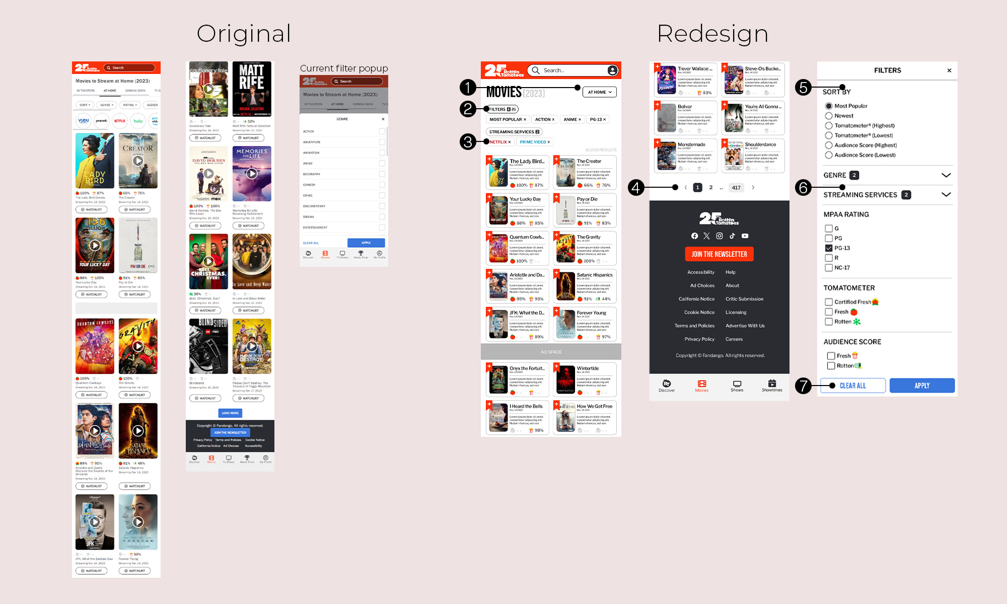
1. Page heading condensed and simplified, category dropdown brought over to the right side to balance the layout
2. Consolidated clickable filter categories into a single, unified popup filter with an interface similar to the desktop. Circle streaming service filter buttons have been integrated within this feature for a more cohesive design.
3. Selected filters are now presented as chips to enhance user visibility.
5. Implemented a page display for search results, replacing the vertical expansion. Users have the option to navigate through results incrementally or input an exact number
5. Overhauled filter pop-up screen, with a similar hierarchy to the desktop version.
6. Filters with numerous options have a counter of the number of filters selected along with a collapse and expand button
7. Enhanced the visual clarity and user experience by unifying the size of the 'Clear All' and 'Apply' buttons
Desktop Selected Item Page
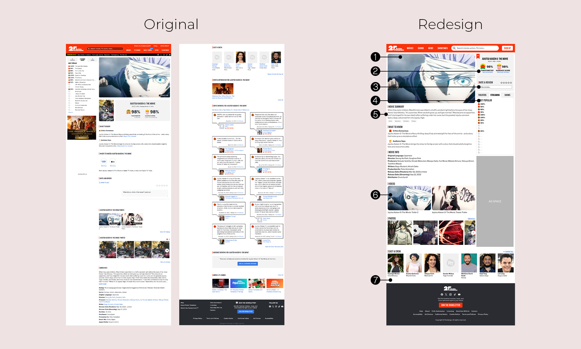
1. Increased the size of the trailer video card to create a more attention grabbing element
2. Repositioned the ratings card adjacent to the trailer video card, incorporated the bookmark button into the card
3. Merged the 'Rate & Review' function with the ratings card to streamline the user experience.
4. Relocated the tabbed movie selectin interface to a lower position, directing user attention to prioritize other essential elements
5. Rearranged the hierarchy of information, moving less pertinent information down
6. Introduced movie tags beneath the movie summary, enriching the content with additional context and facilitating a more comprehensive understanding of the movie's themes, genres or key features
7. Increased the visual impact of the video cards by increasing the size.
8. Critic reviews for movies can be found on the dedicated linked page accessible through the ratings, which offers users a convenient and centralized page.
Mobile Selected Item Page
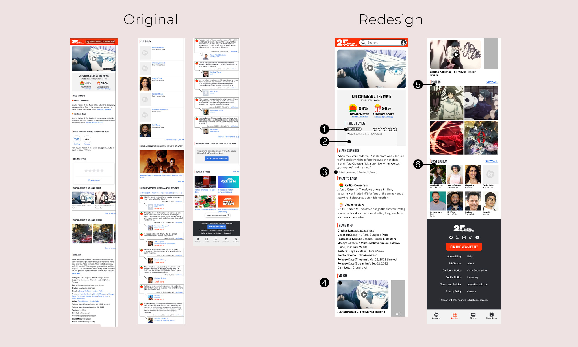
1. Condensed and repositioned the "add to watchlist" button
2. Merged the 'Rate & Review' function with the ratings card to streamline the user experience.
3. Introduced movie tags beneath the movie summary, enriching the content with additional context and facilitating a more comprehensive understanding of the movie's themes, genres or key features
4. Increased the visual impact of the video cards by increasing the size.
5. Transformed the photo gallery to a 2x2 grid
6. Reorganized the 'Cast & Crew' section, allowing for more to be shown with less space