Bakery Rebranding
"The Gluten Free Epicurean" is a longstanding bakery with a rich history, having successfully operated for over a decade.
Goal:
The rebranding project for “The Gluten Free Epicurean” was undertaken with the aim of modernizing the brand identity, making it more appealing to a broader audience. The project encompassed a range of deliverables, including a new brand name, logo, color palette, typography, style guide, a responsive landing page, social media advertisements, and diverse brand assets.
Challenges:
Balancing the modernity and approachability of the brand while keeping true to its gluten-free
Programs used:
Adobe Photoshop, Adobe Illustrator, Figma

I opted for a soft pastel blue as the primary colour, as the colour is associated with trustworthiness and reliability, qualities sought after by the main target audience—individuals seeking a bakery that caters to their dietary needs.
The combination of Quincy for headlines and Asap for body copy establishes a strong typographic palette that reinforces the brand's visual identity, creating a cohesive and engaging design.
Preserving the gluten-free essence of the brand was pivotal for maintaining recognition. The refreshed brand name, "Celiac’s Dream," served as the central inspiration for the logo design, resulting in a distinctive standalone brandmark.
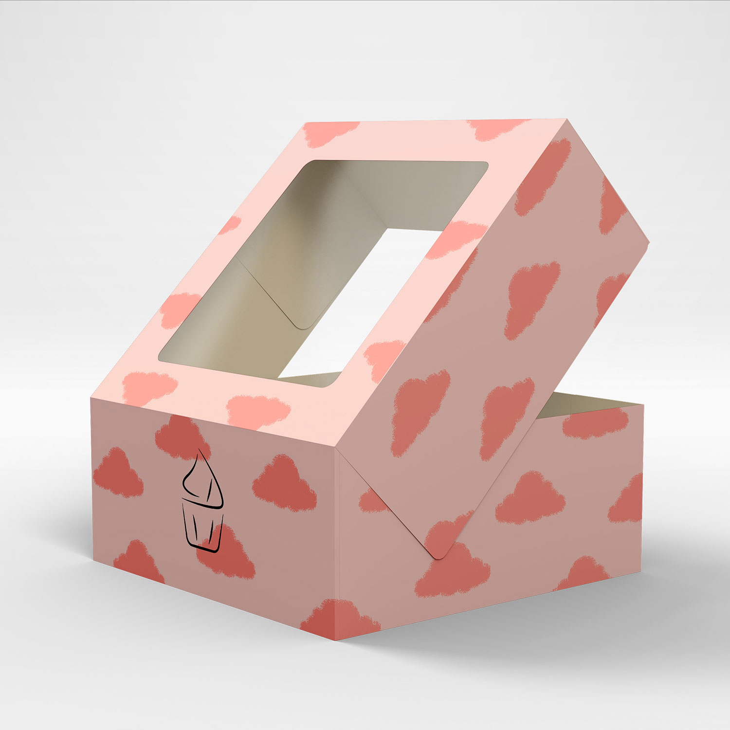


A pattern of cloud motifs were created for various bespoke product packaging, alongside the brand's distinctive colour palette for a visually cohesive design.
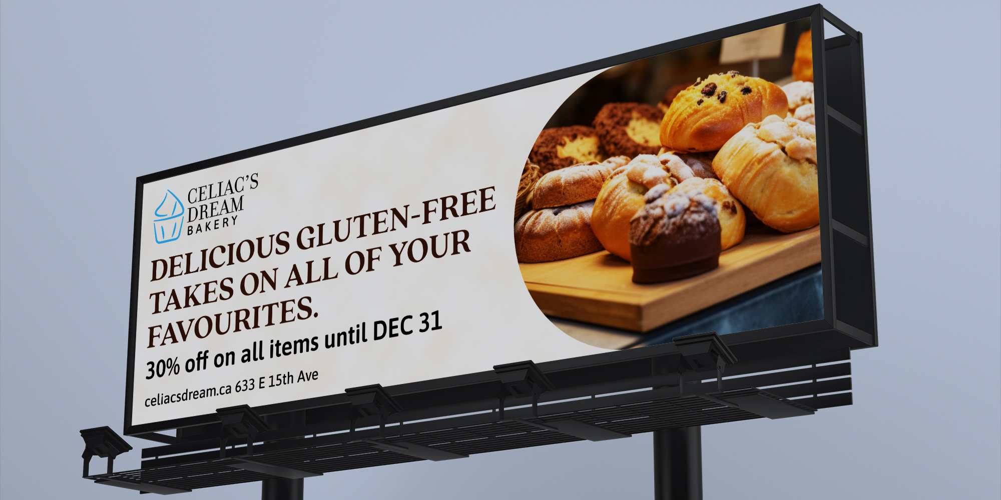
I employed the brand's minimalistic aesthetic in designing the advertisements, leveraging Quincy's bold typographic elements and integrating captivating visuals of the bakery's offerings to market the brand.
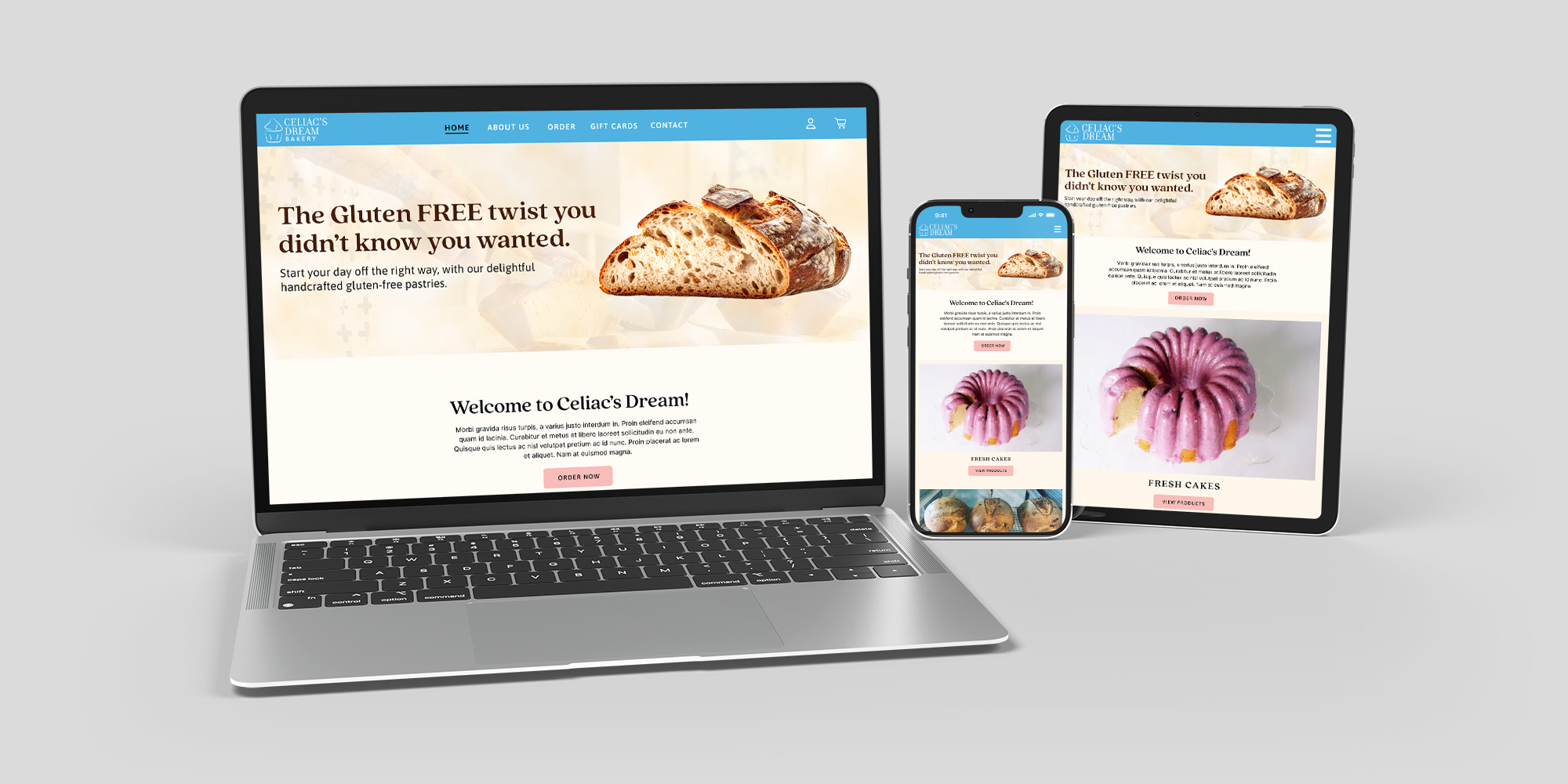
I was also tasked with the development of a responsive landing page. This landing page serves as an informative hub, detailing the diverse array of products and services offered.
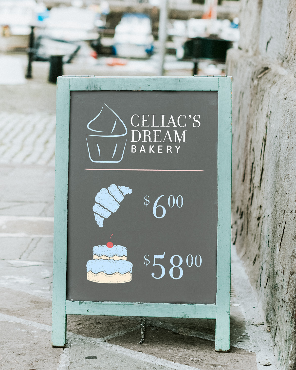

The sandwich board design draws inspiration from chalk artwork, mirroring the stylized illustration.
The standing menu strategically emphasizes the primary selling point of the bakery's products: the pastries, creating a visual appealing and focused presentation.