Promotional Print Piece
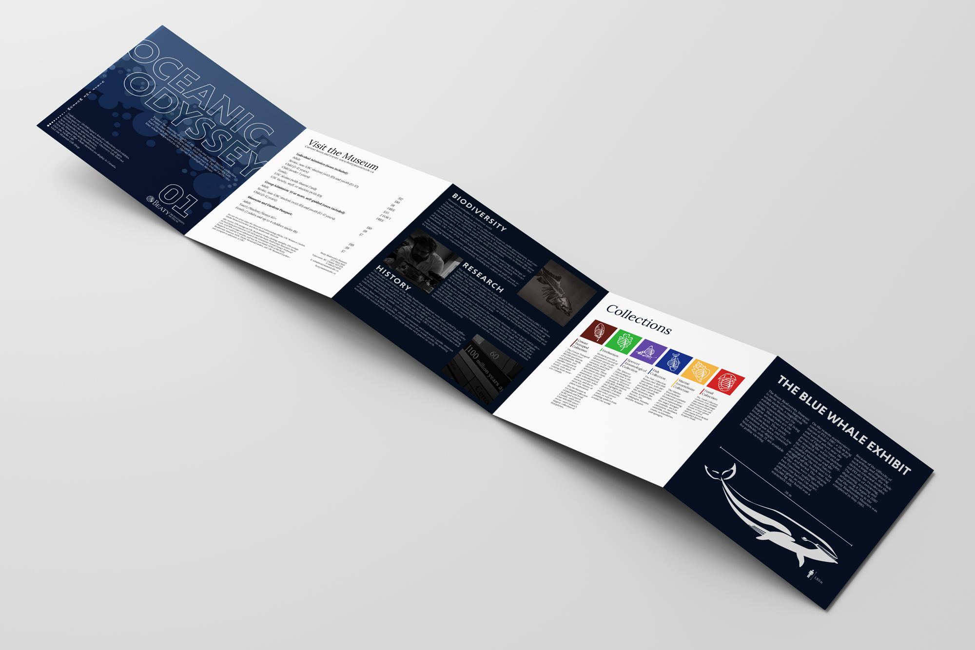
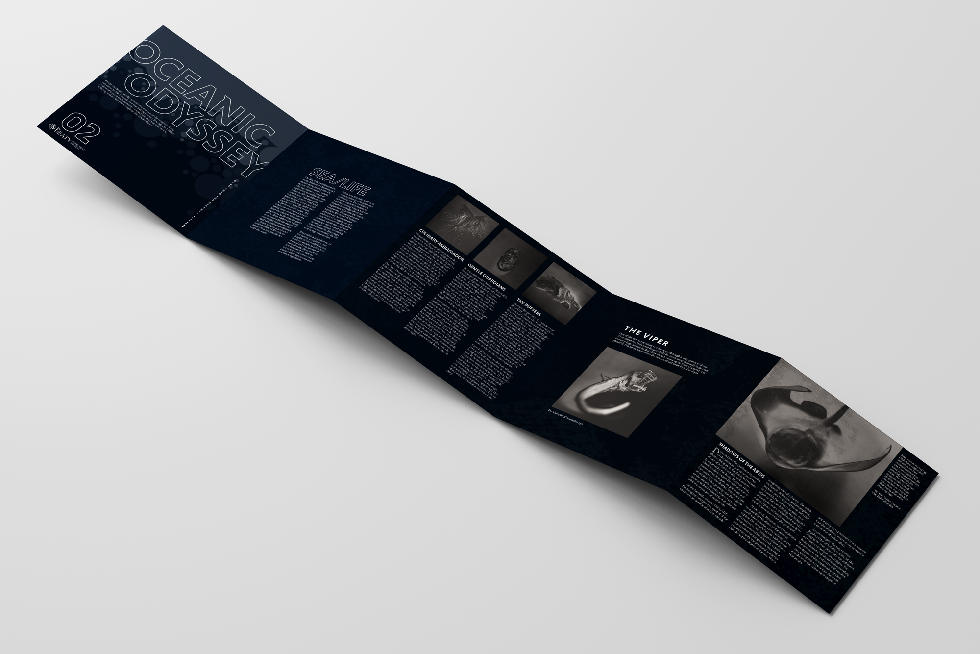
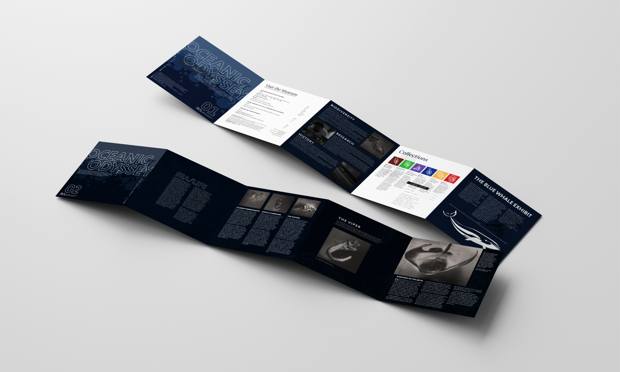
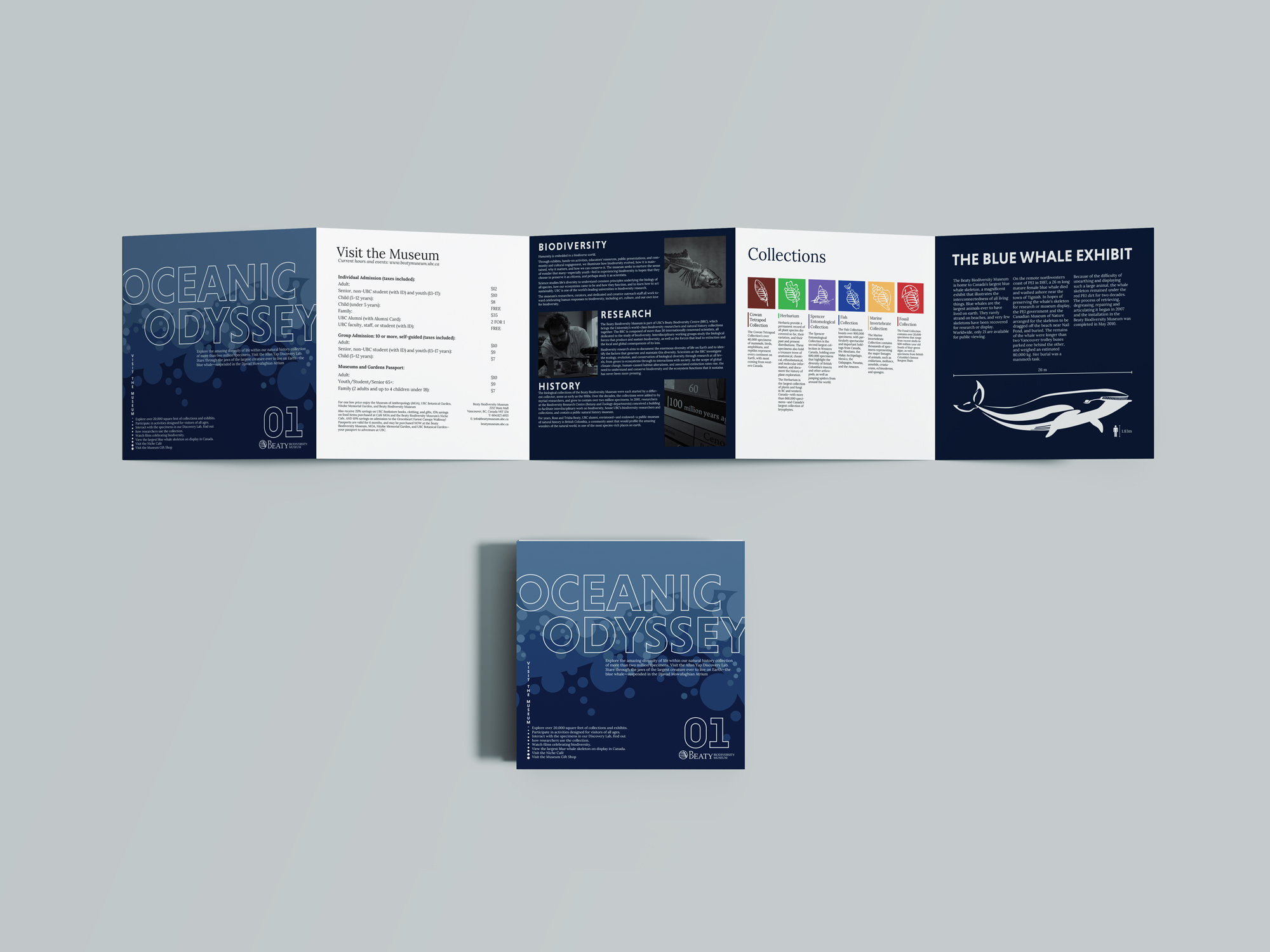
Oceanic Odyssey is a 5-fold accordion brochure created to promote the Beaty Biodiversity Museum and its SEA/LIFE exhibition.
Goal:
The goal for creating this promotional print piece is to blend captivating design with informative content, aiming to entice potential visitors by offering a glimpse into the exhibit. This was done through envoking curiosity by highlighting key features of the museum and the SEA/LIFE exhibition.
Challenges:
Balancing the need for captivating design while retaining the informative nature of the content.
Programs used:
Adobe Photoshop, Adobe InDesign
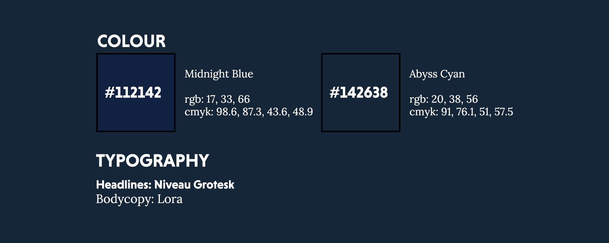
The choice for Niveau Grotesk stems from its alignment with the oceanic theme. The clean and elegant design mirrors the simplicity found in the depths of the ocean. Due to its high visual impact and simplicity, Niveau stands out, ensuring clear communication. Additionally, the shoulder of the “N” resembles a fish fin.
Lora was chosen for its blend of sophistication and readability. With its classic and timeless serifs, Lora adds an elegant touch. The typeface’s balanced proportions and high legibility ensures clarity. Lora contributes to a cohesive and engaging narrative.
The selection for these colours were driven by their association with depth. The deep dark hue of midnight blue evokes the essence of the midnight ocean, aligning with the brochure’s theme of exploration into the depths. Providing a visually appealing background that enhances the overall immersive experience.
Abyss Cyan was chosen to compliment Midnight Blue, adding a touch of contrast and vibrancy to the colour palette. Representing the little light within the ocean’s depths, abyss cyan adds a sense of liveliness enhancing the overall aesthetic appeal.

The side of the brochure that's meant to be looked at first is indicated with the 01 mark. Signifying the introductory section resembling shallow waters, this side serves as an engaging prelude, offering contextual insights into the Beaty Museum. The final page tantalizingly provides a preview of what's to come on the backside, creating a coheisve narrative that entices the reader to delve deeper into the brochure's content.

For the theme of the booklet, I drew my inspiration from the SEA/LIFE exhibit itself. Employing a visual narrative reminiscent of descending the ocean's depths. As the reader traverses the pages, they experience a gradual darkening in mood, mirroring the immersive journey of underwater exploration.