Restaurant Brand Conceptualization
Despite servings as a pivotal traffic corider in Vancouver along Hastings Street, the majority of building branding falls short in quality, failing to reflect the significant importance of this bustling street. There is an opportunity to elevate the visual identity and overall presentation to match the significance of the area, creating a more impactful and engaging urban environment.
Goal:
The objective of this branding project was to create a strong brand for one of the many restaurants on Hastings Street, adding a new fresh face to an otherwise bland street. Infusing warmth and uniqueness to create a memorable and engaging experience that sets the brand apart.
Challenges:
Creating an inviting and approachable brand identity with a compelling selling point, designed to resonate with commuters and motivate them to choose this distinctive branding overmore familiar options.
Programs used:
Adobe Photoshop, Adobe Illustrator
Introducing Whiskers & Wontons, an authentic Chinese soup house infused with a delightful twist inspired by the charm of a cat cafe. Here, savor the authentic flavors of meticulously crafted wonton soups, perfectly complemented by the soothing presence of our resident cats.
Inspired by traditional Chinese culinary branding aesthetics, I conceptualized a brand-defining mascot, a hybrid fusion of a cat and a dumpling. This distinctive visual identity serves as a centerpiece for the brand, embodying a playful and cultural symbol to enhance the restaurants overall appeal.
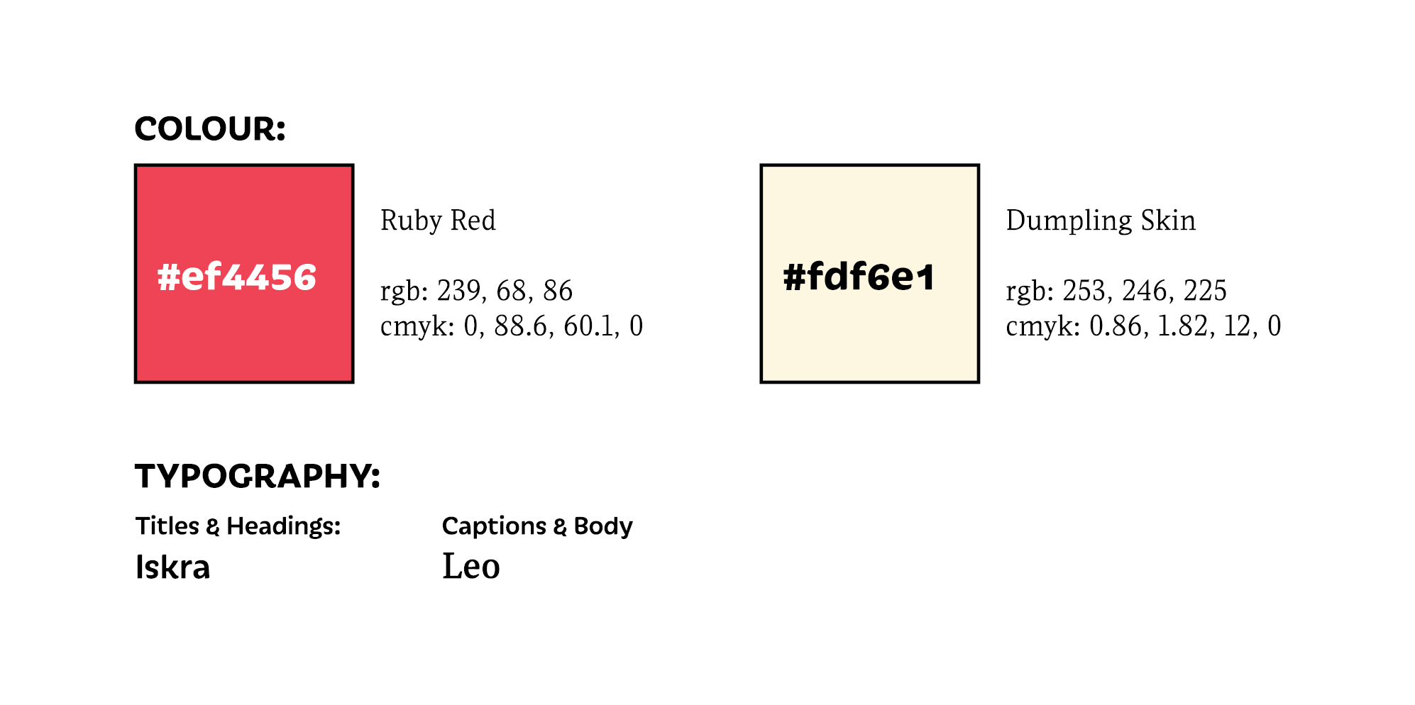
Ruby Red was selected for its relevancy with Chinese culture, being a symbol of joy, happiness, fortune and success. It is also an important colour in the culinary world, due to its ability to stimulate our appetite.
The choice of a dumpling skin beige color for the brand holds strategic significance in conveying authenticity, and the natural essence of traditional Chinese culinary heritage. This color resonates with the familiar shade of the outer layer of a dumpling, creating an immediate visual connection to the core product.
The iskra typeface was selected to convey a blend of playfulness and traditional elegance, striking a balance between professionalism and approachability. Its clean lines and contemporary aesthetic align with the restaurant's urban, chic atmosphere, while subtle curves in the letterforms provide a touch of warmth and friendliness. For body copy uses and information that is less relevant, Leo was chosen for its contrast and readability.
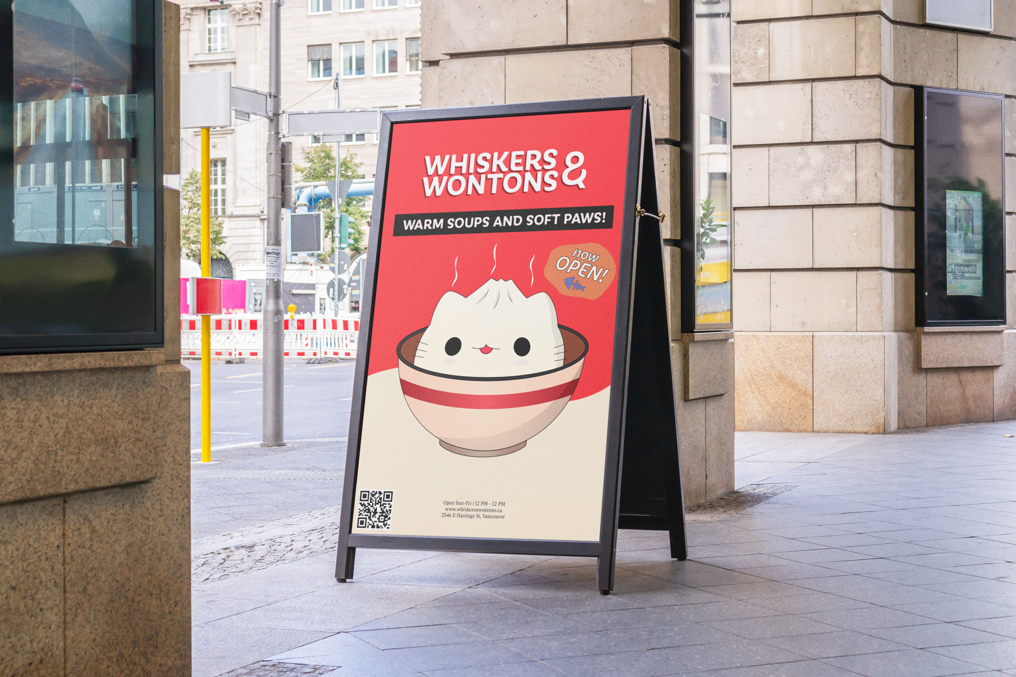
The simplistic design aligns with the brand's values of simplicity and sophistication, allowing the focus to be on the distinctive cat dumpling mascot, intriguing individuals walking by and inviting them into the restaurant.

The design of the apron was kept to the brand's simplicity, using the easily identifiable cat dumpling mascot as the main centerpoint with a tagline specific to the branding on the apron itself.

The packaging design features a vertically oriented variation of the brand logo, complemented with details of the purchase products. This includes a distinct name and a visually appealing image of the food item, creating an aesthetically pleasing and informative presentation that enhances the overall image.